
5 B2B Conversion Rate Optimization Examples
You might be hearing a lot of talk about conversion rate optimization (CRO) for your website — A/B testing, doing research, etc. But when it comes to B2B conversion rate optimization, the audience, the traffic, and the offerings are different from the B2C model. So, it can be challenging to know where to start with CRO for B2B and what it looks like to actually begin making changes and testing results.
Beacon Digital Marketing offers conversion rate optimization as a service for a number of clients in different B2B spaces. Let’s look at two of those clients, Skai and Kustomer, to explore some real B2B conversion rate optimization examples and how they could apply to your website.
Skai is an omnichannel marketing platform that enables smarter decisions and better outcomes with actionable intelligence in making customer connections. Their platform includes a suite of data-driven products for market intelligence, omnichannel media activation, testing, and measurement.
Kustomer, part of Meta, is a customer support platform built for modern brands. Their platform includes customer service automation and management, self-service tools, artificial intelligence, and CRM for customer service.
1. Add a teaser of what you’re offering
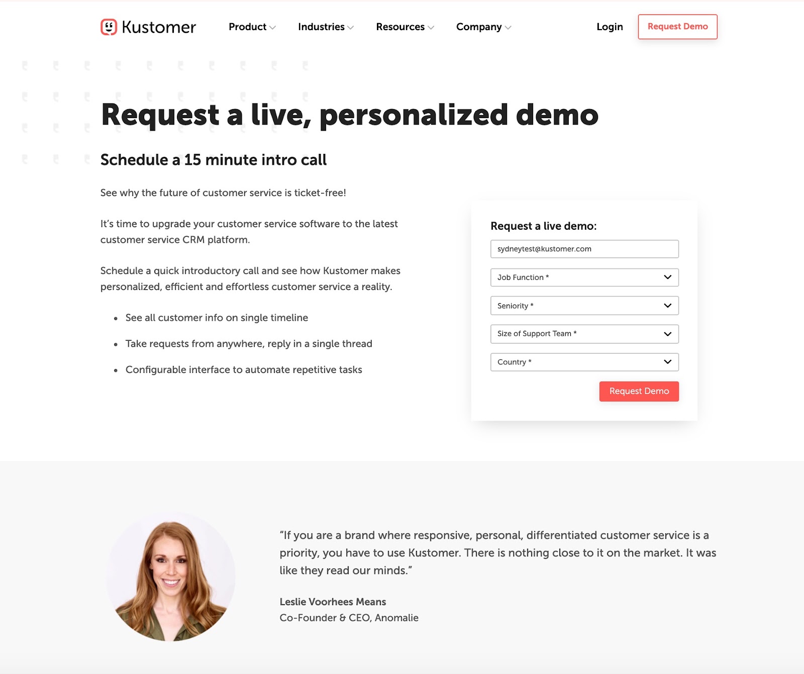
The modern executive or decision-maker is becoming less and less willing to provide their information to gain access to content. Even if your landing page is performing statistically well, the average conversion rate is still only 2.35%. Brands are seeing fewer form submissions and lower conversion rates on gated content, whether that’s a whitepaper, a webinar, or in Kustomer’s case, a demo.
Kustomer was seeing a high CVR of 5.18% for their Live Demo page and only 1.16% for their Video demo page. We wanted to experiment with whether adding a sneak peek of the demo could boost that number for the live demo page, and help increase the video demo.
In order to reduce the barrier to the demo, our team recommended providing teaser videos on the landing page. Giving a small taste of the demo does double-duty for increasing form submissions by proving the value of the complete demo but also enticing those that were on the fence to request the full, live demo.
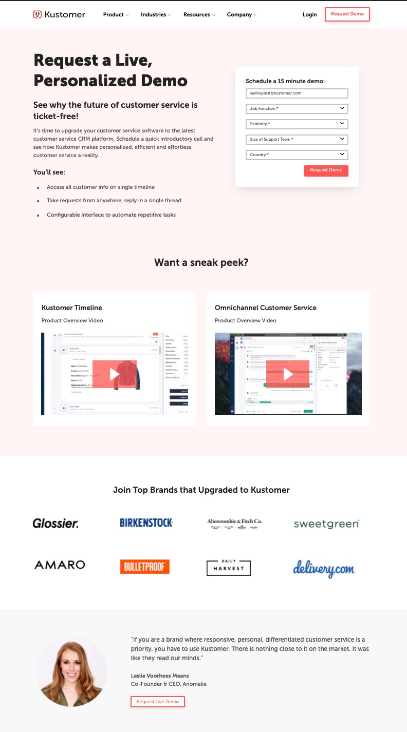
This B2B conversion rate optimization strategy can be applied to any kind of gated content. Serving smaller bites of your content by giving some of it away “for free,” like proprietary data for a white paper or short videos of the speaker for a webinar, helps the user feel confident in the value they’re receiving for providing their information.
2. Add more CTAs
In many cases, looking at how users are interacting with any given page will illustrate that they simply aren’t given enough opportunities to convert when they’re ready. Examining Skai’s Agency Digital Marketing Solutions page, the numbers told a story.
- 95% bounce rate
- 1:38 average time on page
- Zero clicks
- Two CTAs, one at the top and one at the bottom
The content is relatively skimmable and high-quality, so we believed the sub-optimized numbers had less to do with the page content and more to do with the users’ lack of engagement and interaction. Our team recommended adding more CTAs throughout the page, empowering the user to move forward with the next step in their journey at the exact moment they are ready.
3. Try a different layout
Something as simple as switching from one column to two columns can make a noticeable difference. While a centered, one-column alignment is not uncommon, most Western users read from left to right. When we align buttons and text to the left, they get more “exposure” on eye tracking. Text that is centered, on the other hand, is harder to skim and requires more work from the user.
With this in mind, we tested changing Kustomer’s homepage layout from one column to two columns, while leaving the copy and general design unchanged and examined the user reaction.
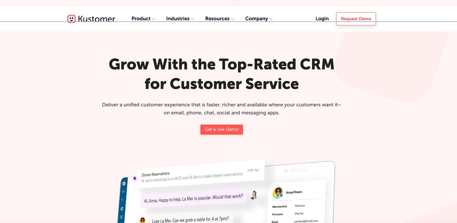
After around 16,000 experiment sessions for both the one- and two-column layouts, the two-column homepage resulted in a higher number of conversion rates and was designated an 85% probability to perform best in Google Analytics.
4. Don’t overdo it with brand logos
Brand logos can be an important source of social proof. In some cases, however, they can also be a source of distraction from the primary purpose of the content. Looking at Skai’s pages, we noticed a few different factors.
First, we noticed multiple sections of brand logos throughout one page, which could be reduced to one section to reduce potential distraction as the user navigates.
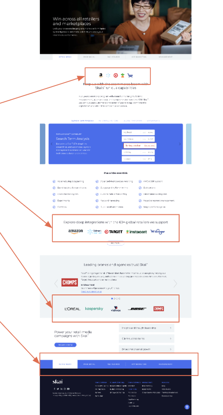
Second, we saw users false-clicking on the information tiles just beneath the hero as well as the logos in the center of the page. As with the other clicks on this page, this could be a way that the users are learning the information. For these logos, we recommended displaying them on a grayscale to maintain social proof while decreasing the user assumptions that they are clickable.
In other cases, such as the below Kustomer landing page, the logos can be so distracting that they impact conversion rates on actions like landing page form submissions. For pages with a clear, singular conversion action, try testing results without the logos altogether, and save the social proof for main site pages.
5. Test navigational adjustments
One way to make the user experience of primary site navigation better for your customers is to follow the patterns in the industry, which is what many organizations do when planning the paths of their navigation bar. But it doesn’t always get to the heart of user intentions if you’re only considering industry competitors to make this decision.
When analyzing Skai’s navigation, we compared it to other industry competitors to see what was aligning and what wasn’t. It’s important to remember that just because something isn’t matching up doesn’t mean it’s a bad thing; in highly saturated and competitive markets, being different can be the right choice as long as it’s still intuitive.
The primary nav bar is the first opportunity on your website to grab a user’s attention, so make sure it’s not too confusing and that the primary CTA action is clear. Compare your navigation with competitors to gauge industry benchmarks, but also use them as a way to stand out and be more useful to the user than your competitor websites. Perhaps by testing something different, you’ll notice something that your target audience has been missing from your industry competition.
To see more B2B conversion rate optimization examples, check out our B2B CRO breakdown blog or drop us a line!
Posted In: B2B, Web Design, UX, cro, conversion rate optimization

Kirsten Trued
Kirsten is a UX Designer on the Web team at Beacon Digital Marketing. She is a natural born problem solver and embraces the ‘everything is figure-out-able’ mindset. She looks forward to learning something new with every client and project. In the past, she has worked in the wellness and publishing industries. While working in wellness, she had the pleasure of working for a female-only boutique studio and developed a passion for women’s rights and empowerment.