
What Is A Landing Page And Why Are They Important?
A landing page is a standalone page that a customer can end up on to learn more about a particular topic and take a specified action. Landing pages are a vital part to your digital marketing strategy. Not only do they provide information to your viewer, they also collect valuable information for you.
In a digital world full of choices – and consumers that often get overwhelmed by those choices – landing pages are a lead generation tool that allow customers to overcome any decision paralysis by leading them to take one specified action. This action can be to register for a webinar, download a white paper, request a demo, or something similar. In sum, these pages operate as the next step in converting a visitor into a customer at a low acquisition cost.
Unlike a traditional content page within a website, landing pages often utilize an adjusted navigation structure in an effort to keep viewers engaged and minimize distraction; keeping conversion rates high.
Components of a Good Landing Page
Creating an effective landing page is both an art and a science. You want to provide the customer with enough information that they feel inclined to take action, but not so much that you scare them away. Here are our best practices for landing page design:
- A well-labeled call to action button: Motivating your customer to provide their information and take action starts with a prominent, easily identifiable CTA button. We suggest a lead gen form or boldly designed button featuring a prominent brand color.
- Scannable content: Finding the perfect balance of detail within your landing page content can be tricky. We suggest prioritizing making your content scannable, not too brief. You want to give the user enough information that you acquire high-quality leads rather than users just needing questions answered.
- Highlight points of difference: If your customer has ended up on your landing page, it’s likely they got there via a paid ad they were served. This could mean they’re also looking at your competitors’ products or services. Beat your customer to the punch–use your landing page to highlight why your company will serve them better than the next competitor.
- High-quality imagery: Images are the easiest way to communicate what your product is. Chances are that a customer who is on your landing page is highly interested in what you’re offering, so giving them a clear picture (literally) will increase conversions.
- Proper form fields: Lead gen forms are a great way to collect customer data. Be mindful of the fields you’re asking your customer to fill out. Decide internally what information you absolutely need from your customer and only ask for those data points–any more and you could lose an impatient or busy customer. Data enrichment services from Clearbit and ZoomInfo could help you reduce the fields you need your prospect to complete.
Top Landing Page Examples
Gong [Request a Demo]
Gong is a sales intelligence platform that has been gaining popularity thanks to their use of Google Ads. On this landing page, they’ve employed streamlined and dynamic data enrichment services from Clearbit. Based on the data the user provides, their web experience might change. For instance, if a company matches an ideal company profile, the user is immediately directed to book a calendar appointment. If they don’t match, then a member of Gong’s team will investigate and follow-up manually. This personalized user experience makes for a great landing page and makes great customer support even more attainable.
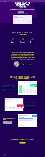
Check out the landing page here.
Cysiv [Request a Demo]
Cysiv uses clear imagery on this landing page to let the viewer know exactly what they’re requesting a demo for. Using both a photo of a user engaging with their platform plus a screenshot of the platform itself invites users to fill out the lead gen form. While this landing page allows users to explore the site through the primary navigation, the page itself highlights enough information to keep the viewer interested.
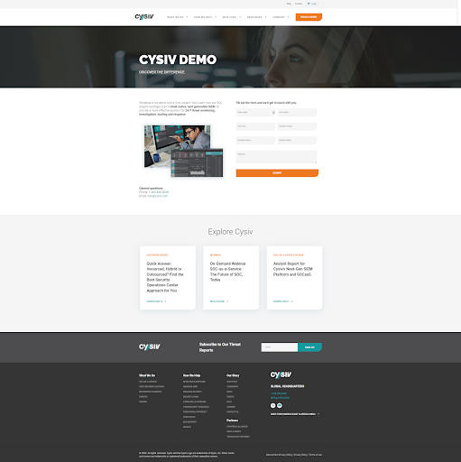
Check out the landing page here.
Pondurance [Request a Demo]
This Pondurance landing page uses clear, direct language in the headline and CTA button. This lets the user know exactly what to expect for this page as well as on the other side of the action. The page gives the user the right amount of information–it’s skimmable but robust enough to ensure a high quality of leads. Clickable elements and form fields are kept to a minimum so that users are steered towards the primary call to action.
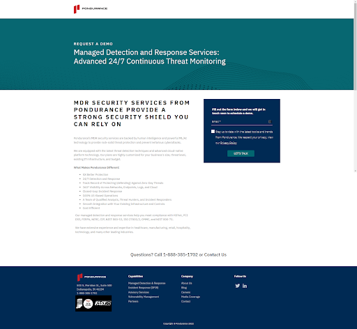
Check out the landing page here.
Kustomer [Request a Demo]
This Kustomer landing page is another great example of using straightforward language to direct customers to your intended CTA. The navigation is still present on this landing page, but the background color blocks allow for the user to stay focused on the content of the page. Kustomer also uses testimonials to exhibit evidence of previous success. The use of testimonials is a nice touch on this landing page as well!
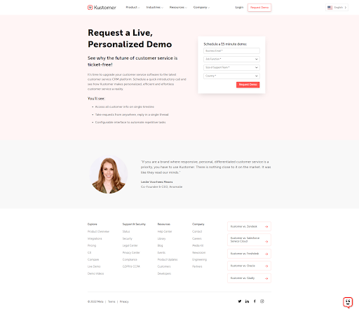
Check out the landing page here.
Looking to make a larger impact with your landing pages and increase your conversion rate? Get in touch with Beacon Digital Marketing today.
Posted In: B2B, Lead Generation, Web Design, UX, SaaS

Kirsten Trued
Kirsten is a UX Designer on the Web team at Beacon Digital Marketing. She is a natural born problem solver and embraces the ‘everything is figure-out-able’ mindset. She looks forward to learning something new with every client and project. In the past, she has worked in the wellness and publishing industries. While working in wellness, she had the pleasure of working for a female-only boutique studio and developed a passion for women’s rights and empowerment.